ShopDreamUp AI ArtDreamUp

Deviation Actions


Description
I am also a DJ/Producer if you would like to check out some of my music. Here is my latest Drum N Bass mix soundcloud.com/beatstax/esc. If you like what you hear there are other original tracks & mixes for stream/download on there as well.
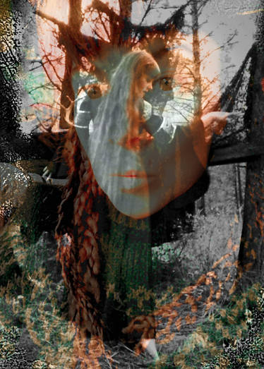
Photo by Daniel Kaye
Model: Lauren Nicole Lymer
texture 16
Image size
3456x5184px 7.46 MB
Make
Canon
Model
Canon EOS 7D
Shutter Speed
1/320 second
Aperture
F/1.8
Focal Length
50 mm
ISO Speed
100
Date Taken
May 1, 2012, 2:16:47 AM
Sensor Size
15mm
© 2013 - 2024 Hydrolyphics
Comments5
Join the community to add your comment. Already a deviant? Log In
The overall composition of this piece is very good. You have lots of darks and lights and they're balanced so no one side is too heavy.
But you've oversaturated it! D: The sharp reds and blacks can be nice in some instances, but the highly contrastive tones in this piece (red, black, yellow) make it hard to look at it for long without feeling overwhelmed. It's a little jarring, especially to sensitive eyes.
When working with textures in photographs, grungy textures look best when they're subtle, but you've used grunge textures in high contrast here, putting it in the blacks . It looks very good on the face because red and skintone are close enough together that the sutbleness looks like aged paper. But you've also put black textures on top of bright orange, and it creates a hole in the picture. My attention is drawn to the grungy black textures, but they're not interesting to look at and they don't easily guide. the eyes anymore.
The umbrella is too lost in all the colors. Because everything is so red, it's hard to find an interesting place because everything is all the same. While unity is important, variety is also important. The red draws the eyes away from the focal point (face) and the viewer quickly loses interest in the image.
There's so much potential in this picture that can come out if it just wasn't so Imma-throw-the-sun-in-your-face. You can make it rain sun without burning the people watching.